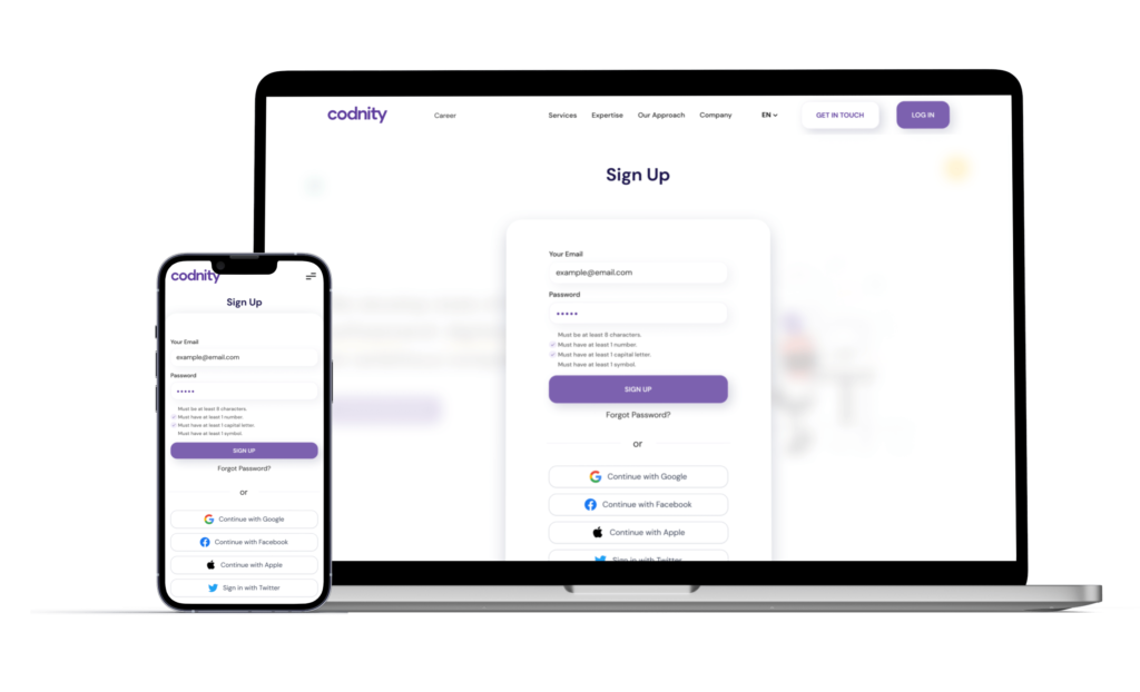
Website redesign
for IT courses
Complete website redesign with various CMS, registration automatizations, and custom code.
Overview
In this case study
Overview
Key Challanges
My Role
Design Process
Think
Make
About the Project
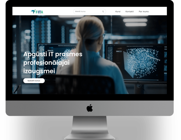
In this project as WEB designer I had to redesign a website from scratch and make it easy for a user to find courses, get the information and register. It involved staying in brand colors but totally recreate Site Map, build CMS for courses and News Articles as well as automatizations after the registration.
Platform
Web
My Role
WEB Designer
Intention
- Redesign a website for IT courses making it user-friendly and easy to maintain
Success Factor
- Fresh and modern design
- CMS for course scheduling.
- Easy registration flow
Key Challenges
Top 3
The content was text-heavy and needed structure
Creating designs from scratch
Need for smooth and frictionless experience
Problems
In the existing website the informations wasn’t easily scannable and client had to maintain and update it regularly but there weren’t any dynamic/ template pages.
Solutions
I built a website that’s easy to use and maintain thanks to simple navigation, easy filtering of courses and frictionless registration. That’s all powered by dynamic content thats manageable with few clicks from user friendly backend cabinet.
My Role
As a WEB designer, I make sure that the design meets and exceeds the stakeholders needs, and website is built using advanced tools and methodologies
Research
All the design decisions should be rooted in a real user problem and lead to a solution.
Development
Build the website from scratch using no-code web builder.
CMS
Create CMS databases and template pages for couses, clases and news.
Usability studies
All the iterations should be tested on real users.
Design Process
Lean UX
Think
Make
Check
These were the deliverables for each stage:
- Competitor analysiss
- User persona
- Sketches
- Likes/ Dislikes
- Sitemap
- Wireframes
- UI design
- No-code development
- CMS
- Usability testing
- Stakeholder and user feedback
- Stakeholder onboarding
Think
In this stage I analyzed competitors and made interviews with stakeholders and potential users to find out their expectations and needs.
Competitor analysis
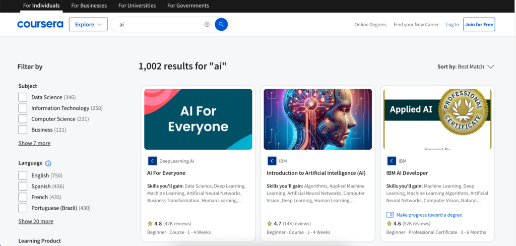
I checked various direct and indirect competitors and compared user flows, website and page structure, responsivity and overall experience.
User-Friendly Interface: Competitors like Coursera and New Horizons prioritize intuitive navigation and clean design, which enhance user experience and make course selection straightforward.
Diverse Course Offerings: A broad range of courses catering to various industries and skill levels, as seen on platforms like Coursera, attracts a wider audience and meets diverse business needs.
Filtering: Letting to apply various filters, as seen with Maven, accommodates different learning needs and schedules, appealing to busy professionals.
Clear Value Proposition: Competitors effectively communicate the benefits of their courses, such as career advancement and skill acquisition, which can help in converting leads into customers.
Overly Complicated Navigation: Some competitors struggle with cluttered interfaces that can overwhelm users, making it difficult to find relevant courses. A streamlined approach is essential.
B2C Sector Specifics: Most of competitors focuses on B2C what can be seen through out navigation, wording and value propositions. In this case more focus should be made on B2B.
Neglecting Marketing Strategies: Some competitors do not effectively promote their courses, resulting in low visibility. A strong marketing plan is necessary to reach potential B2B clients.
Failure to Adapt to Trends: Some competitors that do not keep pace with industry trends and technological advancements may fall behind. Staying current is vital for relevance in the education sector. The same goes for website design as well.
User Persona
Interviews helped to empathize with users and gain better understanding of their past experiences and expectations. It became clear what are their struggles, motivation and factors that influence decisions.

Name: Mark
Age: 40
Education: Bachelor in Economics
Family: Single
Occupation: IT project manager/ Team lead
I’m a busy manager who needs to find comprehensive education partner for my IT team.
What he's looking for
Comprehensive IT courses covering relevant technologies and skills
Flexible learning options (self-paced, live online, blended)
Corporate training packages with volume discounts
Progress tracking and reporting tools
Certifications aligned with industry standards
Challenges
Limited budget for training
Diverse skill levels within the team
Keeping up with rapidly evolving technologies
Balancing training time with work responsibilities
Demonstrating ROI to upper management
Motivation and goals
Upskill team to improve operational efficiency
Reduce reliance on external consultants
Enhance team retention through professional development
Stay competitive in the financial services tech landscape
Improve security practices and compliance
Interests
Building a culture of continuous learning in tech teams
Cross-functional collaboration strategies in IT projects
Employee engagement and motivation in technical roles
Burnout prevention and work-life balance in IT
Sketches
After various sketches were created we found the best approach for each page, so that all the necessary info is presented and available in multiple ways.
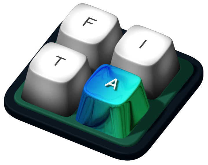
In the ideation phase I even created 3D element representing this IT focused education company.
Make
Next in the process was creating wireframes, and then the hi-fi design. After that I use Wix Studio to bulid the site and created CMS databases.
Sitemap
As usual in such a project I created a Sitemap to visualize information architecture and to make sure all of the necessary pages are included.

Wireframes
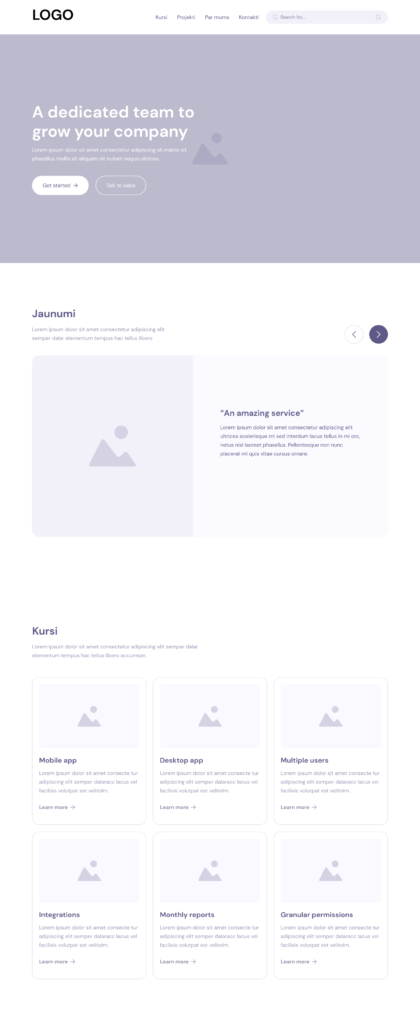
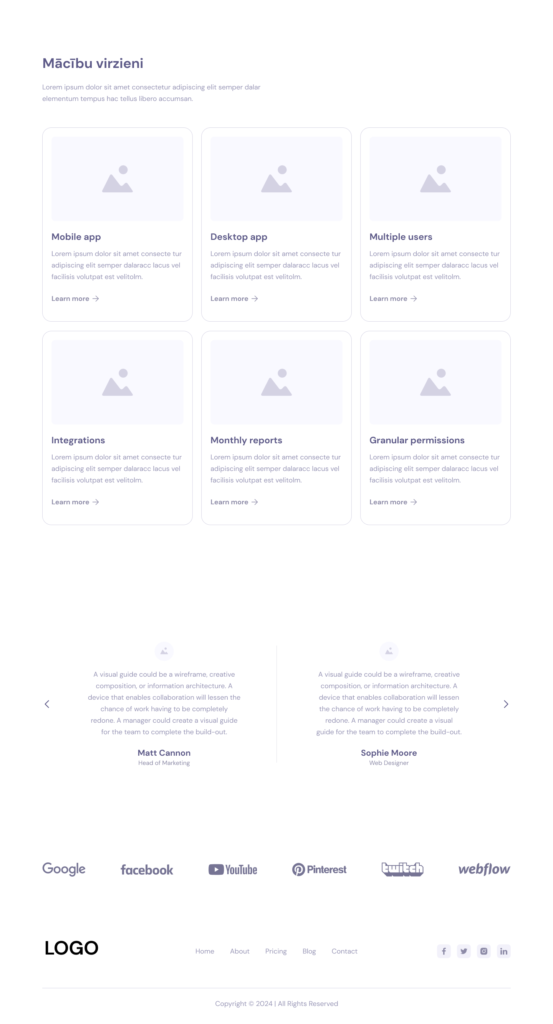
Next all the wireframes were made to discuss possible layout variations and add additional elements and sections that the old version was lacking. This was one of the most longest stages because of discussions of how the information should be presented and how the user flow would play out.
Typography
This is the typography according to the brand.
Poppins
(Semi Bold)
Heading 1
Poppins (Semi Bold)
Heading 2
Poppins (Semi Bold)
Heading 3
Poppins (Semi Bold)
Heading 4
Poppins (Semi Bold)
Heading 5
Inter (Regular)
Paragraph 1
Colors
Logo



Buttons & Icons

Thank you for checking this case study! 👍


