Trigubs Design

E-Comerce App​​

Designed to help busy people order food to home fast and easily.

Go to interactive prototype.

Overview

Complete UI/UX design
Design System | Research | Accessibility | Usability studies | Information architecture | Mockup

In this case study

Overview

Key Challanges

Design Process

My Role

Emphasize

Define

Ideate

Prototype

Test

High Fidelity

Mockups

Interactive Prototype

About the Project

This e-commerce application is designed to provide grocery delivery in regions, outside cities. The application interface is easy to use and there are multiple unique features such as expiration date, item and cart saving to favorites, and advanced personalization.

Platform

Android

My Role

UI/UX
Designer

Intention

  • Creating an easy-to-use app for buying grocery online.
  • Provide unique features and fast user support.

Success Factor

  • Easy navigation process.
  • User error rates.
  • Regular buyers.
  • Relevant suggestions.
  • See progress order until success.

Key Challenges

Top 3

  1. People have limited time for buying groceries.
  2. People doubt grocery delivery efficiency.
  3. Food delivery apps tend to have poor client service.

Problems

There are few grocery store apps available in this region. Some online grocery stores has only web version while others have poor user support. There is a big need of ordering food to home with ease.

Solutions

There are few grocery store apps available in this region. Some online grocery stores has only web version while others have poor user support. There is a big need of ordering food to home with ease.

Design Process

Design Thinking

Emphasize

Define

Ideate

Prototype

Test

These were the deliverables for each stage:

Emphasize

  • Interview
  • Persona
  • Empathy Map
  • User journey
  • Storyboards

Define

  • Problem statement
  • If/ Then Hypothesis
  • We think that…
  • Value proposition

Ideate

  • Brainstorming
  • Competitor analysis
  • How might we
  • Crazy Eights

Prototype

  • Paper wireframes
  • Digital wireframes
  • Low-fidelity prototype

Test

  • Usability testing
  • High-fidelity prototype

My Role​

As a UI/UX designer, I make sure that my designs are well focused on end-users, and can be implemented by developers.

Design System

Creation of a design system as a single source of truth that can be reused across the team.

Research​

All the design decisions should be rooted in a real user problem and lead to a solution.​

Accessibility

The UI should meet the guidelines of WCAG and W3C.​

Usability studies

All the iterations should be tested on real users.​

Information Architecture​

Organization of information in a clear and logical way.​

Mockups

Create a mockup for each screen providing all the necessary details and properties for the developers.​

Emphasize

In this stage, I find out the user’s point of view, their frustrations, and their struggle to understand.

Interviews

I conducted 5 user interviews online and made empathy maps to get in the user’s shoes. The main user group identified through research was a young parents between the age 25-50 years, who are daily home with kids and do not have a time to go to the shop.

What features do you miss at online grocery stores?

Relevant pictures
Expiration dates
Nutritions
Relevant pictures
Expiration dates
Nutritions

How often do you buy groceries?

Once a week
Every other week
2-3 times a week
Once a week
Every other week
2-3 times a week

What challenges have you faced when buying things online?

Lack of support
Long delivery times
Unintuitive interface
Lack of support
Long delivery times
Unintuitive interface

What device do you use when ordering shopping online?

Phone
Laptop
Other
Phone
Laptop
Other

Results

As was assumed before this is one of the main customer types for the app. Additionally, research showed that lack of time was not the only problem for users. It’s crucial to see the relevant pictures, expiration dates, and nutrition. And as they are cooking for the family long delivery times does not work for them.

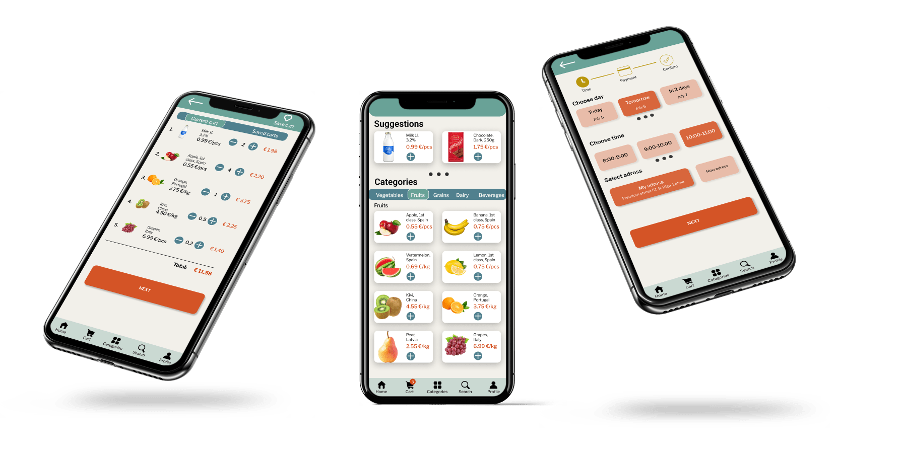
Usually I have only one hand free when ordering food online.
Jane
Housewife
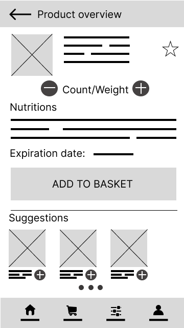
I like to see a real product or a relevant picture at least.
Carl
Student
I have had negative experience ordering food with short expiration date.a
John
Freelance accountant
I have my favorite food that I buy every week, I would love to somehow save the items in favorites and order them multiple times.
Kim
Volunteer worker

User Persona

After the interviews I assembled all the information about users to create a user persona.

Name: Anna
Age: 34
Education: Bachelor in Economics
Family: Married, 2 kids
Occupation: Housewife (ex. manager)

I’m a busy mother who needs order food to home quickly because of a lack of free time.

About

Anna has a lot of tasks at home with kids and that’s her full time job in this season. She’s looking forward to continuing the office work in few years but till then she wants to be efficient at home. Anna love gadgets, apps and products that help make the day easier.

Goals

Order food to home with ease. Find best offers fast. Add to basket by multiple time during day
I need to know what I order so the picture, expiration date and nutrition should be relevant.

Personality

  • Open
  • Overwhelmed
  • Exploring
  • Thinking
  • Optimistic

Frustrations

Sometimes the delivery time is too long.
Sometimes item turns out unavailable at the checkout.
Some apps are hard to navigate.
Small assortment.

Empathy Map

Next I made empathy map to synthesize research data and better understand how users make decisions.

Think

  • Apps should be more developed.
  •  Online food is more expensive now.
  • I need to know the expiration date.
  • The pictures of products tend to be incorrect.
  • Can delivery times be faster?

Feel

  • Relieved if someone brings food to home.
  • Frustrated if an app crashes or is lagging.
  • Irritated if the item turns out unavailable at the checkout.
  • Annoyed if the checkout process isn’t clear enough.
  • Impatient if the support team isn’t available.
Persona-1

Say

  • I want to order food to home with ease.
  • I’m looking for ways to make my daily life easier.
  • I love to try new apps and gadgets.
  • I don’t like apps where I have to log-in each time.
  • I have some favorite meals and would like to order some items multiple times.

Do

  • Buy food once a week.
  • Uses phone more than PC.
  • Holds the phone only with one hand.
  • Reads the nutrition info as well as ingredients.
  • Multitasks at home all day long with kids and other duties.

User Journey Map

Creating a user journey map was a strategic and user-focused approach to design. This dynamic tool guided the design process and ensured that the final product met the needs and expectations of its users.

Define

In this stage, my primary focus was on clearly articulating the problem or challenge at hand based on the insights gathered during the previous “Empathize” stage. 

Problem statement

Anna is a housewife with two kids who needs order food to home quickly because of a lack of free time.

Then these 2 techniques were used to develop hypothesis:

If / then...

If we provide clear and high-quality product images, then the user experience will be enhanced, leading to increased confidence in purchase decisions.

If expiration dates are displayed prominently, then user concerns will be addressed, fostering trust in the platform.

If nutrition information is integrated into product details, then health-conscious users will be better informed and more likely to engage with the service.

If a favorites feature is enabled, then users like John will be able to order their preferred items more easily, streamlining the shopping process.

We think that...

We think that providing clear and high-quality product images will enhance the user experience.

We think that displaying expiration dates prominently will address user concerns and build trust.

We think that integrating nutrition information into product details will cater to health-conscious users.

We think that enabling a favorites feature will support users like John in ordering their preferred items easily.

We think that providing real-time availability information will reduce frustrations at the checkout.

We think that optimizing delivery times and offering expedited options will improve overall user satisfaction.

Value proposition

“Streamlined Grocery Bliss for Busy Lives”

Discover a grocery shopping experience tailored to your hectic schedule:

  • Visual Confidence: Crystal-clear images for confident choices.

  • Trustworthy Details: Prominent expiration dates and nutrition info for peace of mind.

  • Effortless Navigation: One-handed mobile use for seamless multitasking.

  • Instant Favorites: Easily reorder go-to items with a simple tap.

  • Real-Time Convenience: Stay updated on availability for frustration-free checkouts.

Revolutionize your shopping routine with us – where simplicity meets efficiency, designed especially for your busy lifestyle. Welcome to grocery shopping, made easy.

Ideate

 This stage is focused on divergent thinking, encouraging to explore a variety of solutions without judgment.

These were the things I did in this stage:

  • Brainstorming
  • Competitor analysis
  • How might we
  • Crazy Eights

Some insights in "How might we"

How might we make the online grocery shopping experience more visually engaging for users like Anna, ensuring that relevant product images are not only accurate but also aesthetically pleasing to enhance user confidence in their choices?

How might we streamline the process of reordering favorite items for users like John, providing a seamless and intuitive interface that allows them to add frequently purchased products to their basket effortlessly?

How might we reduce delivery times to address the time constraints of users like Anna, ensuring that the online grocery service becomes a quicker and more convenient solution for their busy schedules?

How might we enhance user trust and satisfaction by addressing frustrations related to unavailable items at checkout, implementing a system that proactively updates users on product availability and suggests suitable alternatives to prevent disappointment?

Information Architecture

This was process of organizing, structuring, and labeling content effectively and sustainably. The technique I used was card sorting.

Prototype

Created in Figma

The steps I took

  1. Paper wireframes
  2. Digital wireframes
  3. Low-fidelity prototype

Paper wireframes

Digital wireframes

Low-fidelity prototype

After creating digital wireframes, I connected the screens into a functional prototype, ready for tests.

Test

As the fifth stage came usability testing. 4 users tested the prototype according to the main user group.

Usability tests

I conducted remote tests with video and audio recordings.

Accesability

One of the users was with glasses. So I got feedback about text size.

Some of the feedback

  • Hard to find the saved cart
  • Couldn’t find the categories
  • Easy order process
  • Would love to save a product

Affinity Diagram

After usability studies, I collected all the feedback verbal and nonverbal, and created an affinity diagram.

High Fidelity

Regarding high fidelity, my task was to choose the font, colors, icons, and visuals for the app, giving users a better understanding of how the product will look and function.

Typography

This is the typography that was chosen according to the brand and the product.

Roboto (Semi Bold) 24

Heading

Libre Frankiln (Medium) 14

Subheading

Libre Frankiln (Regular) 11

Body

Libre Frankiln (Semi bold) 11

Button

Libre Frankiln (Semi bold) 16

Menu

Colors

Buttons

Cards

Icons

Mockups

Here are the screens of the final version. After first 2 iterations various changes has been made to make user- flow easy and fun.

Interactive Prototype

Here is an interactive prototype that you can try yourself.

Thank you for checking this case study! 👍

Scroll to Top