As a UI/UX designer, I needed to add login functionality to an existing website. They wanted a responsive design that would work seamlessly across web and mobile devices. The client also emphasized the importance of clear password requirements, error messages, and easy social media login options. I took on the challenge and created a new login system from scratch, ensuring that it aligned with the client’s brand and met all accessibility standards.
Platform
Web
My Role
UI/UX
Designer
Intention
Make it possible for employees and customers to login to an account.
Success Factor
Easy login and registration.
User error rates.
Key Challenges
Top 3
No login functionality before
Create the entire login process from scratch.
Need for smooth and frictionless experience
Problems
The client’s website had no login functionality before, so I had to create the entire login process from scratch. The client wanted a smooth and frictionless experience, with clear password requirements and error messages.
How did I approach the challenge of creating the login system from scratch?
It started with research to understand the pain points and needs of the target audience. From there, I created a detailed user flow and wireframes to ensure a seamless user experience.
Solutions
I created login process with falliar look and feel plus easy to understand password requirements at registration.
What was my thought process behind the design choices?
I wanted to ensure that the design was both visually appealing and easy to use. I incorporated the client’s brand colors and fonts while ensuring that the buttons were easy to understand and interact with.
Design Process
Lean UX
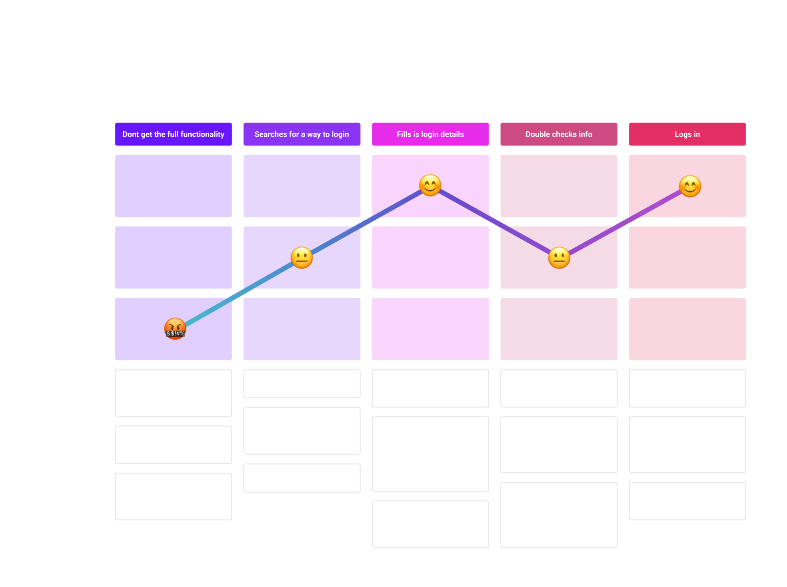
Think
Make
Check
These were the deliverables for each stage:
Outcomes
Assumptions
User research
Ideate
Sketches
Storyboards
Wireframes
UI design
Mockups
Prototype
Analyze data & analytics
Usability testing
Stakeholder and user feedback
My Role
As a UI/UX designer, I make sure that my designs are well focused on end-users, and can be implemented by developers.
Research
All the design decisions should be rooted in a real user problem and lead to a solution.
Accessibility
The UI should meet the guidelines of WCAG and W3C.
Usability studies
All the iterations should be tested on real users.
Mockups
Create a mockup for each screen providing all the necessary details and properties for the developers.
Think
This stage aimed to understand user perspectives, frustrations, and challenges and find similar login screens that users use.
User Journey
During the login process users often struggle to find the login button as it’s not emphasized, leading to searches in the wrong places. They face difficulty in retaining login information, as the system doesn’t save profiles and requires manual entry. Users also express uncertainty about the correctness of their email and password, with no clear feedback provided, creating hesitation during login.
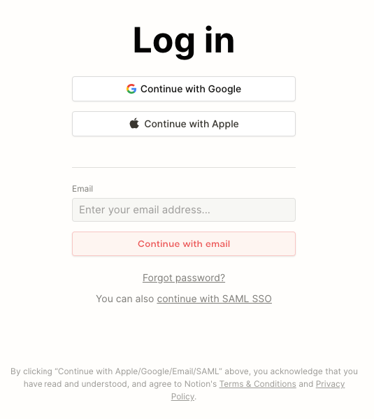
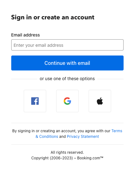
Similar Log-In Screens
After conducting an in-depth analysis of various screens that users typically encounter, I can confidently say that I have identified key similarities and differences. My expertise in this area has allowed me to effectively compare and contrast these screens, providing valuable insights into how they can be improved.
Notion.so
Booking.com
Behance.net
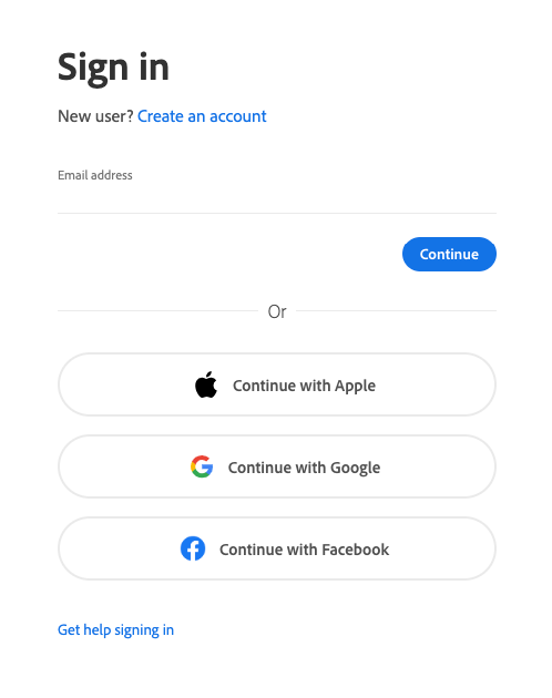
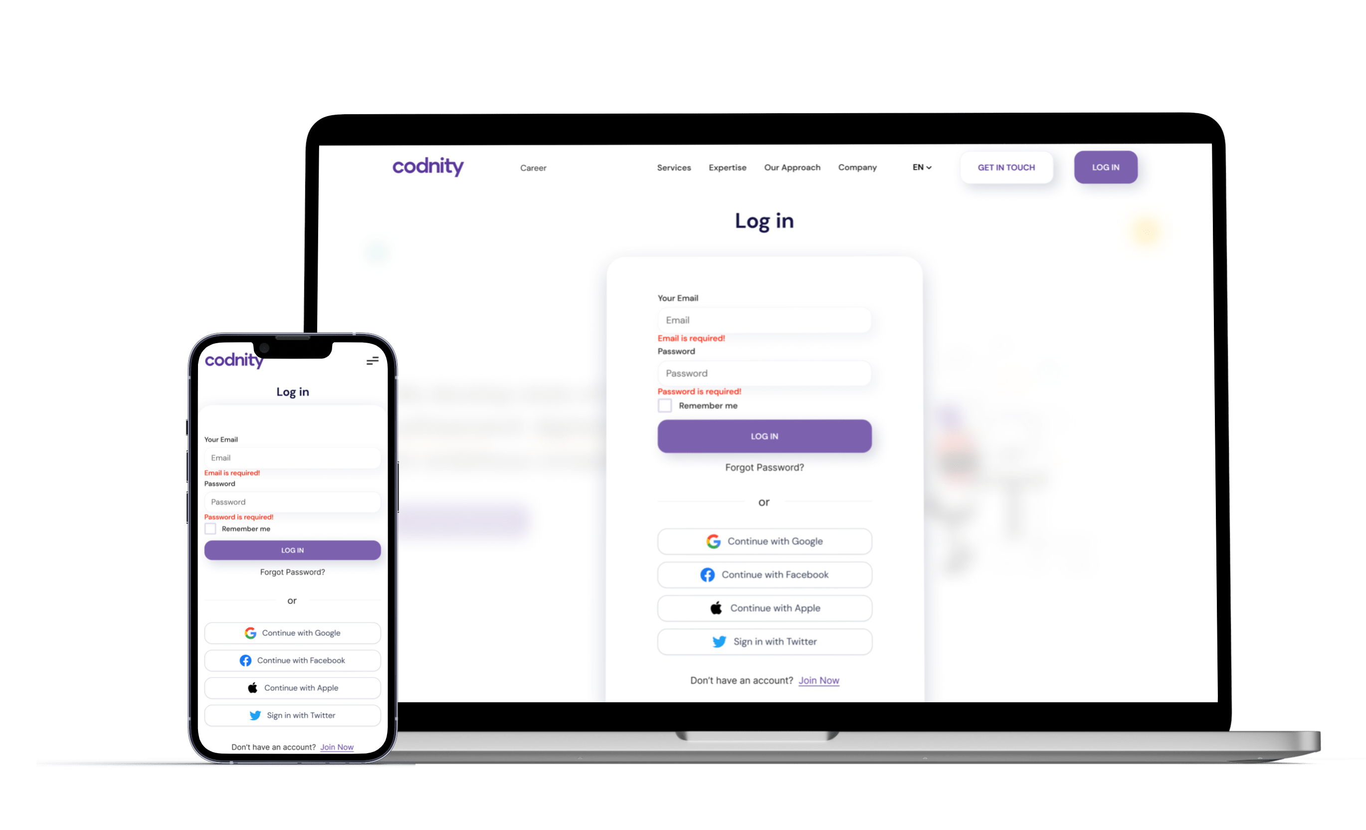
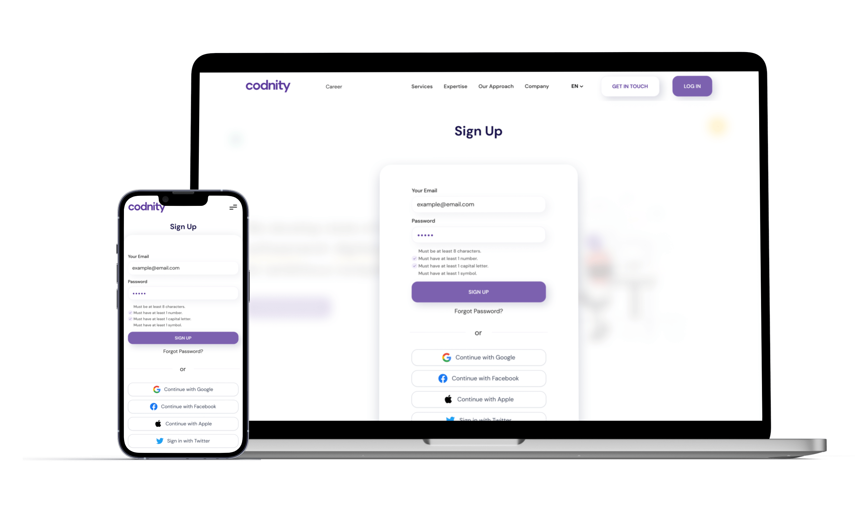
Username/Email Field: This is where users enter their username or email address associated with their account.
Password Field: Users input their password in this field. The password should be masked for security reasons.
Login Button: A prominent and labeled button that users click to initiate the login process.
Remember Me Checkbox: An optional checkbox that allows users to choose if they want the system to remember their login credentials for future visits.
Forgot Password Link: A link that users can click if they forget their password. It typically leads to a password reset or recovery process.
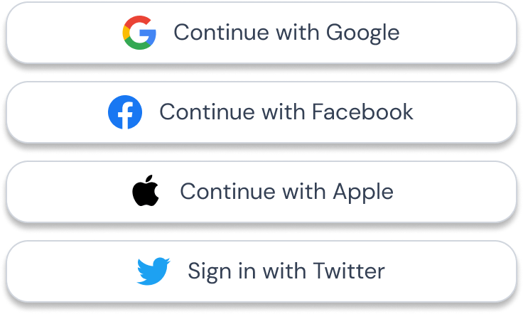
Social Media Login Options: Buttons or icons that enable users to log in using their social media accounts, such as Google, Facebook, or Apple ID.
Registration or Sign-Up Link: A link that directs new users to the registration or sign-up page to create a new account.
Error Messages: These are displayed if users enter incorrect login credentials or encounter other issues. They should provide clear guidance on how to resolve the problem.
Security and Privacy Links: Links to the terms of service, privacy policy, and security information for users who want to learn more about the platform’s policies.
Overwhelming Visuals: Avoid cluttering the login screen with excessive graphics, animations, or distracting elements that can confuse or slow down users.
Hidden Error Messages: Ensure that error messages are displayed prominently and are not hidden, so users can quickly identify and address login issues.
Complex Captchas: Overly complex or challenging captchas can frustrate users. Use captcha systems that are user-friendly and accessible.
Excessive Fields: Don’t request too much information on the login screen. Keep it minimal to reduce friction during the login process.
Ambiguous Wording: Use clear and concise language for labels, instructions, and error messages. Avoid technical jargon that users might not understand.
No Password Recovery Option: Always provide a way for users to recover their password if they forget it. Avoid locking users out without recourse.
Non-Mobile Optimization: Ensure that the login screen is responsive and mobile-friendly to accommodate users accessing the platform from various devices.
Style Guide
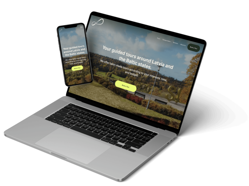
To streamline the design process I recreated the homepage in Figma using a plugin: “html.to.design”
Process
After the initial redesign phase, I was able to determine the appropriate color scheme, font choices, button sizes, corner radiuses, and shadows necessary for the project. I conducted thorough testing in the browser using an inspector to ascertain the appropriate settings for different button states. Utilizing this knowledge, I created a seamless login experience in line with the aesthetic of the homepage.
Typography
This is the typography according to the brand.
DM Sans (Bold)
Heading 1
DM Sans (Bold)
Heading 2
DM Sans (Bold)
Heading 3
DM Sans (Bold)
Heading 4
DM Sans (Bold)
Heading 5
DM Sans (Normal)
Body
Colors
Socials
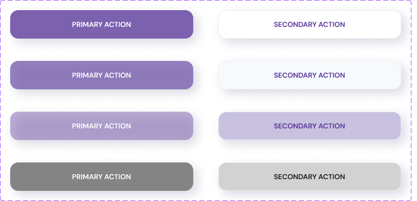
Buttons
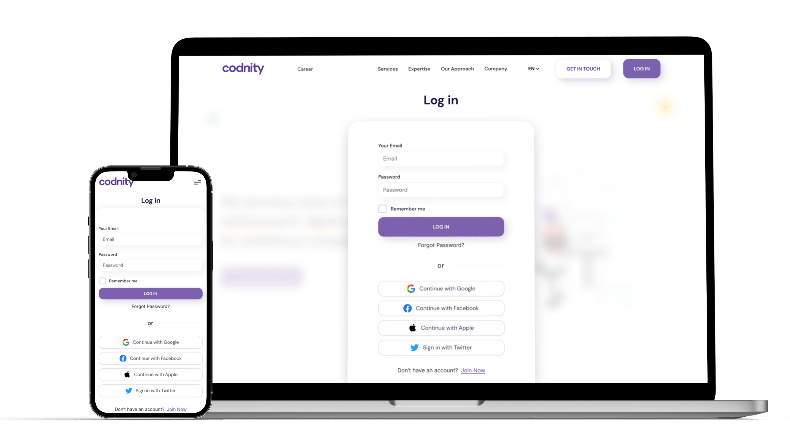
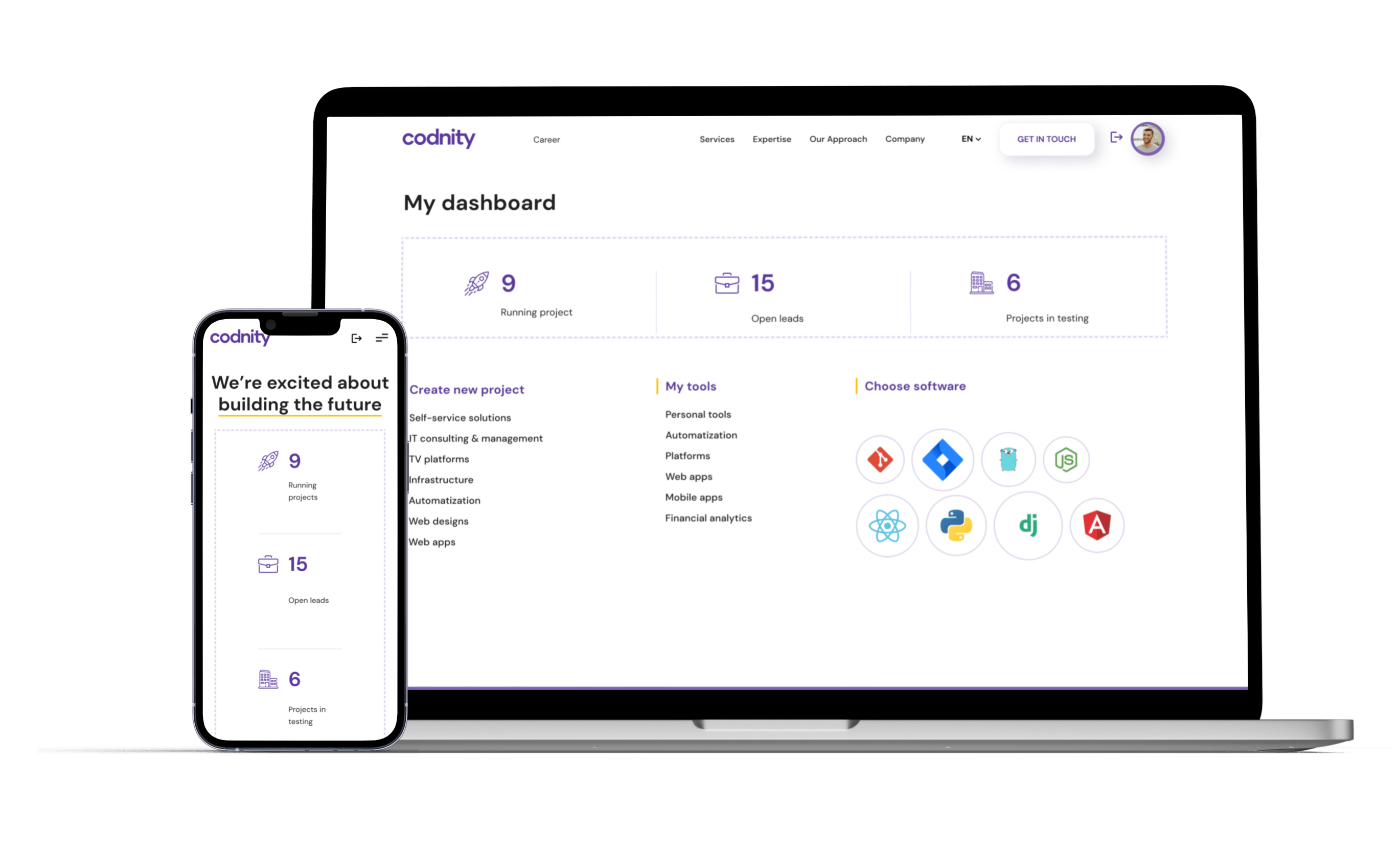
Mockups
High-fidelity mockups that visualize the final design. These screens represent the culmination of iterative design improvements aimed at enhancing the user experience.
Interactive Prototype
Here is an interactive prototype that you can try yourself.