Company Website
Responsive website for a tourism company providing tailor made tours around the Baltic States.
Overview
Complete UI/UX design
Design System | Research | Accessibility | Usability studies | Information architecture | Mockup
In this case study
Overview
Key Challanges
Design Process
My Role
Emphasize
Define
Ideate
Prototype
Test
High Fidelity
Mockups
Live Website
About the Project
As a UI/UX designer, my mission was to design a website that not only showcases Buysocial.org’s unique offerings but also serves as a customer acquisition tool. The primary focus was on creating a responsive design that seamlessly adapts to both web and mobile platforms. Moreover, the client emphasized the importance of integrating video content into the website’s experience. With these objectives in mind, I embarked on the journey to develop a website that aligns with the client’s vision and complies with accessibility standards.
Platform
Web
My Role
UI/UX
Designer
Intention
- Creating a user-friendly platform for booking personalized tours.
- Offering unique features and responsive customer support.
Success Factor
- Easy navigation process.
- User error rates.
- Easy booking process.
Key Challenges
Top 3
Integrating Video Content: The client had a strong emphasis on video content, requiring effective integration without compromising the overall user experience.
Responsive Design: Ensuring that the website is equally user-friendly on both web and mobile devices was a top priority.
Bookable Tours and Services: Implementing a seamless booking system for tours and services while maintaining a user-centric approach.
Problems
Buysocial.org lacked an effective online platform to attract potential customers and showcase their services. The existing website was not complete or optimized for mobile devices, potentially missing out on a significant portion of the audience. Potential customers faced difficulties when attempting to book tours and services, resulting in lost opportunities.
- Lack of an Online Presence.
- Booking Complexity.
- No brand awareness.
Solutions
The solution was to create a responsive and visually engaging website for Buysocial.org that effectively addresses these challenges:
- Comprehensive Online Presence.
- Seamless Mobile Experience.
- Efficient Booking System.
- Strategic Video Integration.
Design Process
Design Thinking
Emphasize
Define
Ideate
Prototype
Test
These were the deliverables for each stage:
Emphasize
- Interview
- Persona
- Empathy Map
- User journey
- Storyboards
Define
- Problem statement
- If/ Then Hypothesis
- We think that…
- Value proposition
Ideate
- Brainstorming
- Competitor analysis
- How might we
- Crazy Eights
Prototype
- Paper wireframes
- Digital wireframes
- Low-fidelity prototype
Test
- Usability testing
- High-fidelity prototype
My Role
As a UI/UX designer, my role encompassed ensuring user-centric designs that could be effectively implemented by developers.
Design System
Creation of a design system as a single source of truth that can be reused across the team.
Research
All the design decisions should be rooted in a real user problem and lead to a solution.
Accessibility
The UI should meet the guidelines of WCAG and W3C.
Usability studies
All the iterations should be tested on real users.
Information Architecture
Organization of information in a clear and logical way.
Mockups
Create a mockup for each screen providing all the necessary details and properties for the developers.
Emphasize
In this stage, I find out the user’s point of view, their frustrations, and their struggle to understand.
Interviews
I conducted 5 user interviews online and made empathy maps to get in the user’s shoes. The main user group identified through research was individuals and couples who travel to Europe, typically between the ages of 25-50 years.
What device do you use when booking a tour?
How often do you travel abroad?
What challenges have you faced when booking a tour online?
What device do you use when ordering shopping online?
Results
The lack of the relevant videos and descriptions was not the only problem for users. It’s crucial to have fast response time, cancelation options and simple, intuitive interface. And as they are mostly traveling once a year, they need to see genuine reviews to gain the trust.



User Persona
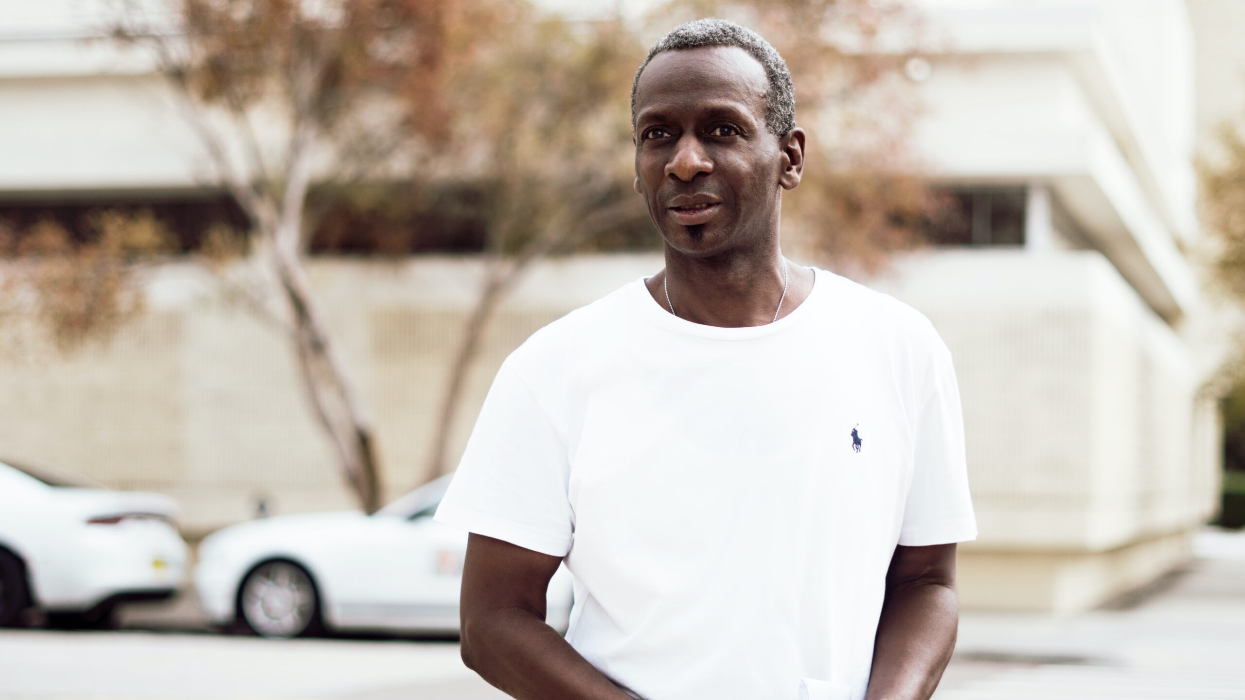
After the interviews I assembled all the information about users to create a user persona.

Name: Emily
Age: 47
Education: Master in Business management
Family: Married, 3 kids
Occupation: CEO in online retail shop
I’m a busy business woman and a mother. We love to travel abroad once a year and explore new places with familiy.
About
Emily is founder and CEO of a online retail shop. Despite her busy career, Emily and her family prioritize an annual adventure abroad, valuing the bonds they forge and the experiences they share. Emily embodies the pursuit of balance, seeking convenience and memorable moments in her travels.
Goals
- Conveniently book tours and services.
- Quickly find the best tour offers.
- Read reviews from other travelers.
- Read descriptions and watch videos and photos to gain deeper insight.
Personality
- Open
- Organised
- Cautious
- Optimistic
Frustrations
- Long response times.
- No cancelation options
- Unintuitive interface
- Lack of tour descriptions
Empathy Map
Next I made empathy map to synthesize research data and better understand how users make decisions.
Think
- Looks for tour websites that offer advanced features to enhance her booking experience.
- Emily values access to comprehensive information, including images, videos and descriptions
- Desire for Expedited Services: She wonders if there are ways to expedite the travel booking process
Feel
- Experiences relief when her travel plans are successfully booked.
- Becomes frustrated if travel websites encounter technical glitches or lag during her bookings.
Irritated when tour items she desires become unavailable during the booking process. - Annoyance when travel booking processes are unclear or convoluted.
- Impatient when support teams are unresponsive to her inquiries.

Say
- I desire for a hassle-free travel booking experience.
- I actively look for travel tools and apps that can simplify my family’s travel experiences.
- Im interested in exploring new travel apps and gadgets to enhance my journeys.
- I don’t like to repeatedly logging into travel platforms.
Do
- Travels abroad with family once a year in summer.
- Primarily uses her laptop for travel bookings.
- Searches for genuine reviews online and asks friends suggestions for family trips.
Define
In this stage, my primary focus was on clearly articulating the problem or challenge at hand based on the insights gathered during the previous “Empathize” stage.
Problem statement
Emily is the CEO in the retail shop who wants to book a convenient and memorable tour for her family’s vacation in Latvia because they travel abroad only once a year.
Then these 2 techniques were used to develop hypothesis:
If / then...
If we strategically integrate high-quality video content across the website, then users will engage more with the content, leading to increased time spent on the site.
If the booking system is optimized for mobile devices, then users, particularly those like Naomi who primarily use phones for searching and booking tours, will experience a smoother and more convenient booking process.
If we prominently feature genuine reviews on the website, then users, including Emily, will be more likely to trust the services offered, resulting in higher conversion rates for tour bookings.
We think that...
We think that a visually stunning homepage with concise information will grab users’ attention and encourage exploration.
We think that strategically integrating high-quality video content across the website will create a more engaging and immersive user experience
We think that clear tour descriptions with captivating visuals will meet user expectations, especially for those seeking in-depth insights into offered tours.
Value proposition
“Discover Unmatched Adventures with Buysocial.org: Your Gateway to Tailor-Made Tours in the Baltic States!
🌍 Explore Beyond Boundaries: Embark on personalized journeys that transcend the ordinary.
📽️ Immersive Video Experiences: Dive into the heart of your next adventure with captivating videos showcasing the beauty, culture, and thrill of each tour, bringing destinations to life before you book.
🤳🌟 Trusted by Travelers: Build your travel plans on the foundation of genuine reviews, creating a community of trust. Join others like Emily, a CEO and mother, in confidently choosing Buysocial.org for unforgettable family journeys.
At Buysocial.org, we don’t just offer tours; we curate experiences, build trust, and redefine your travel expectations. Your adventure begins here!”
Ideate
This stage is focused on divergent thinking, encouraging to explore a variety of solutions without judgment.
These were the things I did in this stage:
- Brainstorming
- Competitor analysis
- How might we
- Crazy Eights
Some insights in "How might we"
How might we enhance the user’s video experience on the website to make it even more immersive and compelling, encouraging longer engagement?
How might we streamline the mobile booking process further to ensure a seamless and convenient experience, especially for users like Naomi who primarily use phones for tour bookings?
How might we encourage more users to share their authentic travel experiences and reviews, creating a dynamic community that builds trust among potential travelers?
How might we refine our accessibility features to ensure that the website is not only compliant with standards but also goes above and beyond to provide an inclusive and enjoyable experience for all users, regardless of their abilities?
Information Architecture
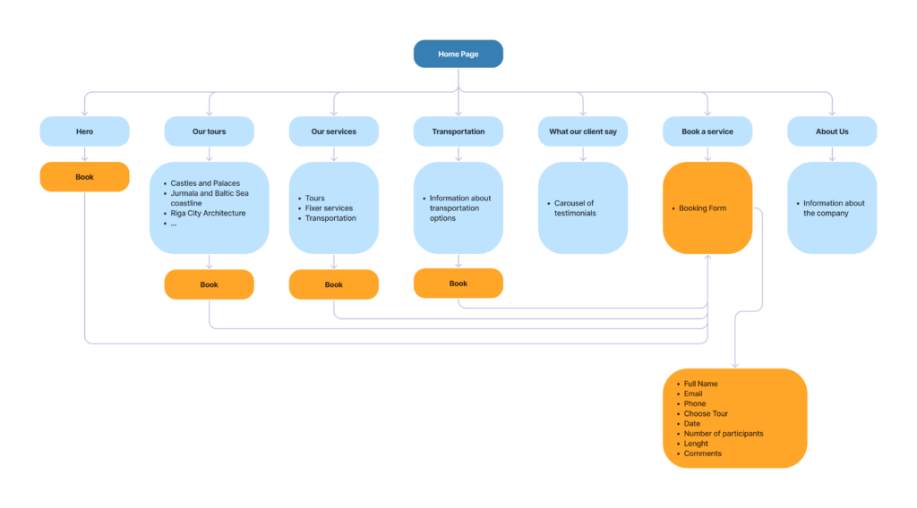
This was process of organizing, structuring, and labeling content effectively and sustainably. The technique I used was card sorting.
Prototype

Created in Figma
The steps I took
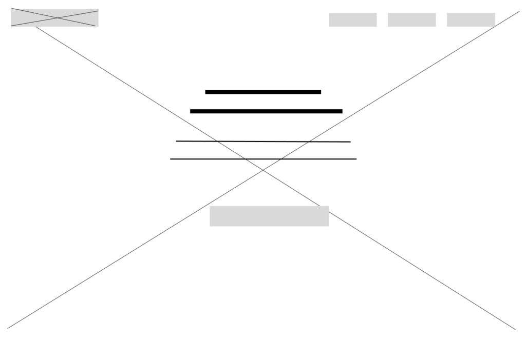
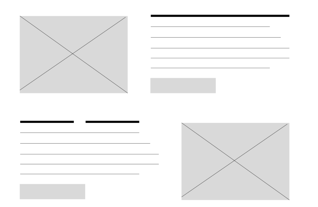
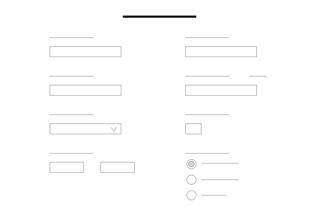
- Digital wireframes
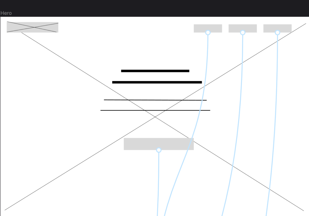
- Low-fidelity prototype
Digital wireframes

Low-fidelity prototype
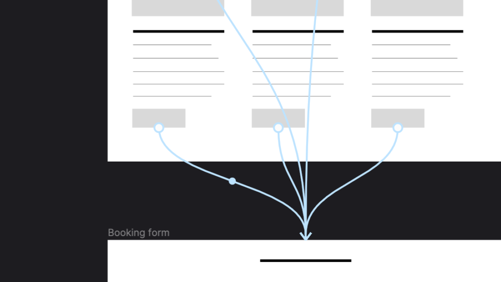
After creating digital wireframes, I connected the screens into a functional prototype, ready for tests.
Test
As the fifth stage came usability testing. 4 users tested the prototype according to the main user group.
Usability tests
I conducted remote tests with video and audio recordings.
Accesability
One of the users was with glasses. So I got feedback about text size.
Some of the feedback
- Hard to find the right tour
- It was easy to book
- Would love to have more facts about the tours
Affinity Diagram
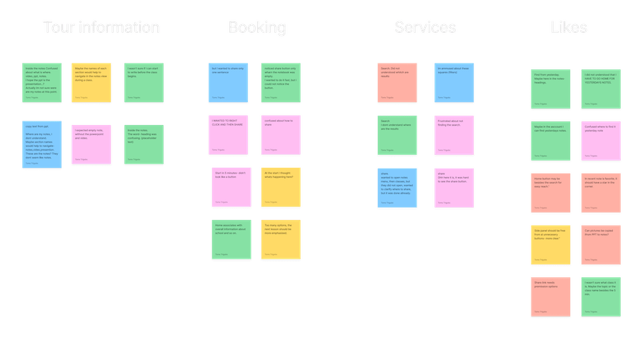
After usability studies, I collected all the feedback verbal and nonverbal, and created an affinity diagram.
High Fidelity
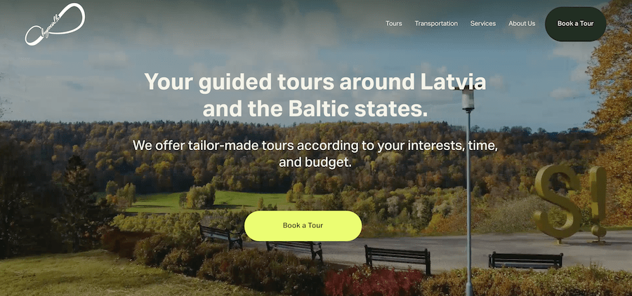
Regarding high fidelity, my task was to choose the font, colors, icons, and visuals for the app, giving users a better understanding of how the product will look and function.
Typography
This is the typography that was chosen according to the brand and the product.
Aktiv Grotesk (Normal) 50
Heading 1
Aktiv Grotesk (Normal) 40
Heading 2
Aktiv Grotesk (Normal) 30
Heading 3
Aktiv Grotesk (Normal) 20
Heading 4
Inter (Normal) 16
Body
Colors
Buttons


Hero section
Mockups
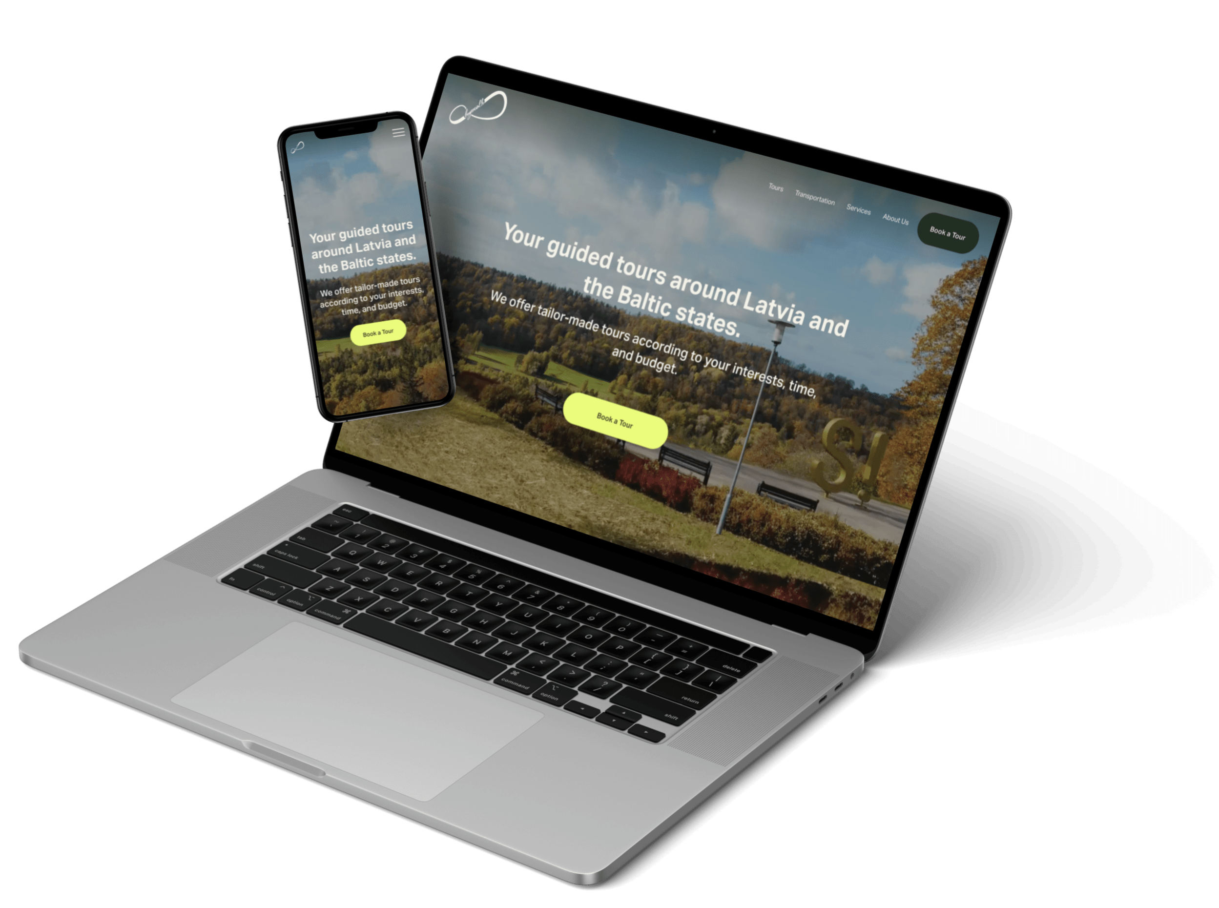
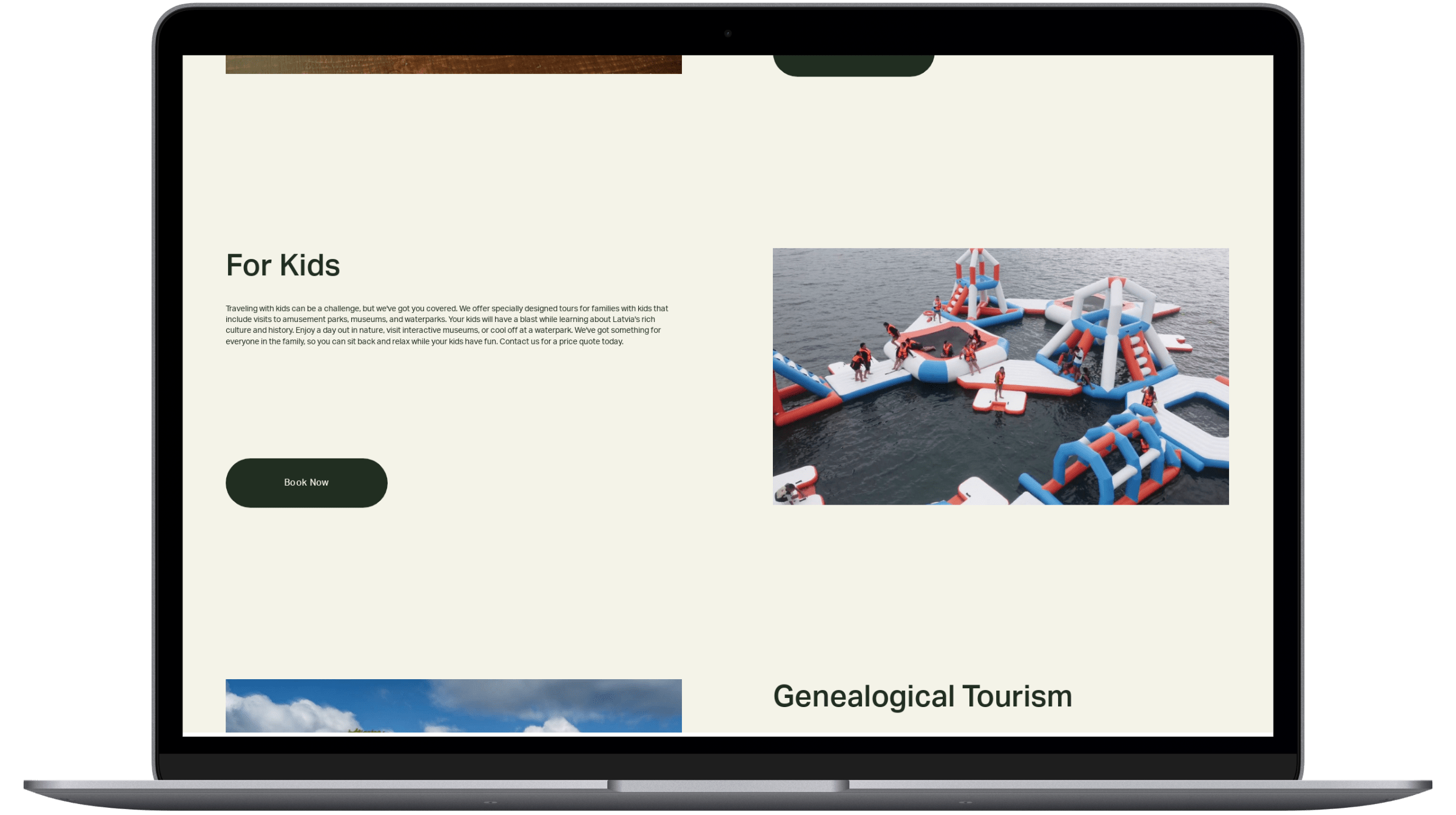
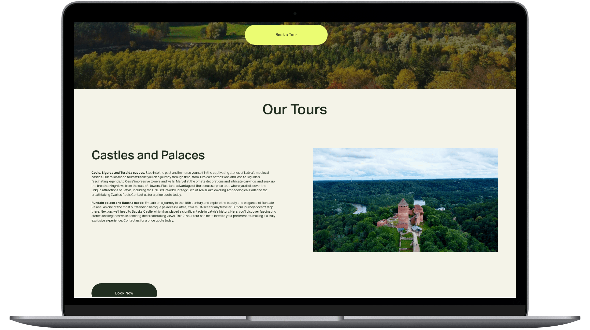
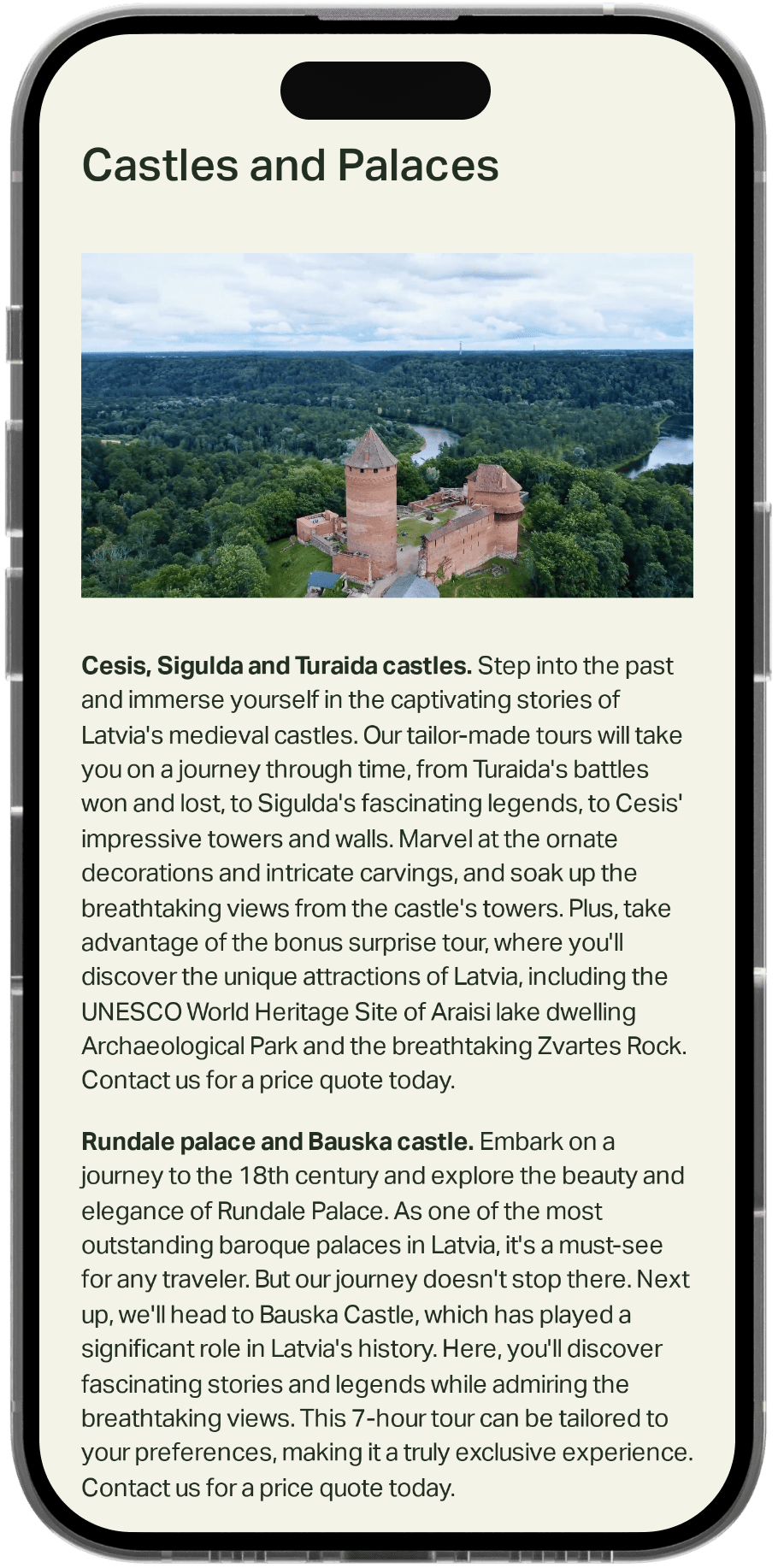
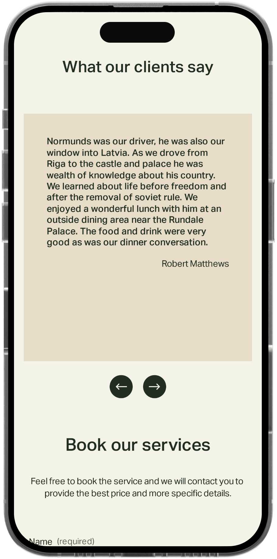
Here are the screens of the final version.
Thank you for checking this case study! 👍

